 |
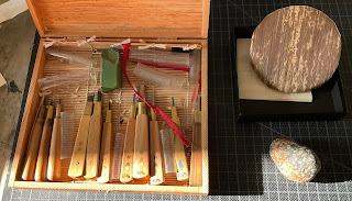
| My carving tools for moku hanga, including a newly sharped aisuki chisel. Along with baren that has just been newly wrapped in bamboo sheath. The bamboo was softened before wrapping using the stone at bottom right. |
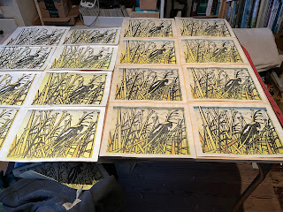 |
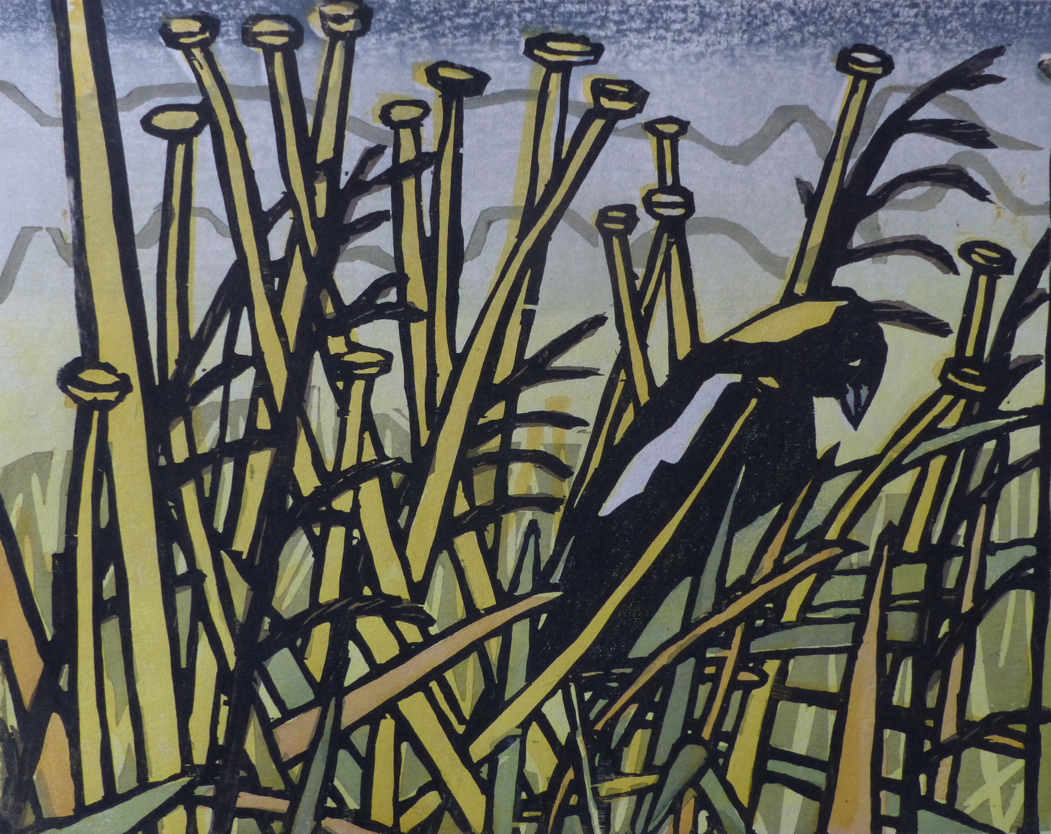
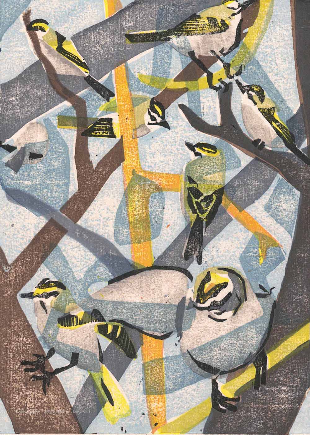
| Most of the proofs I made as I developed the moku hanga of the Bobolink at Dixon Meadow Preserve. I will start printing edition today or tomorrow. |
I had a great revelation today. After thinking about a new blog post that would talk about the 4th International Mokuhanga Conference as well as the craft and technique that is part of mokuhanga I kept coming up with this big caveat: I generally don't like technique in my work or anyone's.
The revelation, at least to me if not necessarily the rest of the world, is that craft and technique are different! Though I've never really cared about technique and did not have an artistic education that stressed it I nonetheless have always been appreciative of tools, of any sort, and learning how to appreciate them and use them as they were made to be used. There is a great sense of both accomplishment and also something akin to moral grounding in appreciating a good tool and learning how to use it for its intended purpose. Good tools are a gift to humanity, just like art and nature.
Today I finally realized that craft is learning how to use the tools of your craft. In mokuhanga in particular it means that you learn, slowly, how to use the various carving tools, and also how to sharpen them, learning how they differ from most western-style tools. I have no problem at all with this type of craftsmanship. It's necessary first off. You can't do much carving if you don't have sharp tools and know how to use them. But it also entails I think an appreciation for the maker of the tools, especially all the hand tools that are used in mokuhanga, as well as for their history. Back when I dabbled, and I do mean dabbled, in fine carpentry, I loved buying using chisels and planes from the 1800s or earlier(always at a very cheap price I should add). I had gotten tired of power tools, which probably are necessary if you need to work quickly, but otherwise are to me just a pain. There is something much more rewarding, though with a learning curve, in hand tools, like chisels and planes. But in addition I just got a real kick out of using a 19th century plane once used by someone in France, or a chisel used in England or early America, etc., etc. You are holding a piece of history and also continuing it.
Craft also means I forgot to mention learning about how barens work, how the wood you carve works, in particular how Japanese paper works. The recovered baren at top would look quite amateurish if I turned it over so you could see how the bamboo ends are tied off among other things. But it's something I've been dreading doing for quite a while and yet I knew that you really have to learn how to do it. Your bamboo cover will eventually develop problems and they will damage the much more expensive coil that is beneath the bamboo cover. This is my second recovering. The first was adequate but the bamboo had cracked just outside the surface of the baren. I knew it was only a matter of time before it migrated onto the surface and would cause me to stop printing and replace it. Since I was about to start printing the edition of the bobolink I decided it was best to do my second recovering before I started. It has been more than adequate and I'm finally experiencing what others have talked about, the feeling of great sensitivity in the baren. So these are just some aspects, at least to me, of craft in mokuhanga. I guess you could say that learning how to print a good bokashi(shading) or many other types of. surfaces is also a craft. And I think that is true. Bokashi is also a tool in your toolbox, though it was one that for a long time I really couldn't see myself using. But I think this may be where the confusion comes. Having the ability to print a good bokashi is having the craft of bokashi. But often it seems that it. is used more to show that you can do it rather than because the print calls for it. Then it becomes technique.
Technique. as distinguished from craft, seems often to just mean facility. Facility is of course useful. But there are often times where facile is also soulless. Artists I think know this, but audiences often don't. In any case that is why I've been ambivalent about craft in printmaking and especially moku hanga. Now I realize that I'm not ambivalent. I like and appreciate craft in printmaking and moku hanga. It's technique that has become facile that I don't like. (I should add that when I first started making wildlife art I used a very vigorous compressed charcoal and heavy erasure method of working. I'd used it for years in my abstract work and I was sure that my facility in its use would cover my very significant ignorance of the structure of birds. It worked I think but it was a dead end. So I forgot about and instead spent years going back to the remedial work of figuring out how birds are put together. But I did abandon ship on my facility with charcoal).
I should add that I think that there is a fair amount of facile technique in printmaking, which perhaps has something to do with my never being totally taken with it. But it's not necessary to printmaking. I don't want to get off on a tangent so I'll just say in summary that much printmaking, though less so moku hanga I think, seems musclebound. The soul of the artist is buried under the avalanche of technique.
Enough! Now back to Moku Hanga and the 4th International Moku Hanga Conference. I felt both odd and apprehensive about applying for the Sumi-Fusion Exhibition that was part of it. Though I'm now in my sixth year of moku hanga printing I've also done painting and sketching during that time. I've certainly not been fully involved in it. And I've never studied it with anyone. Finally I know that I have mastered neither craft or technique. So in many ways you could say I'm an impostor.
On the other hand since the first time I tried it I fell in love with it, in spite of the huge number of travails along the way. So I decided to apply for the exhibition and also register and pay my fee for largely but not completely virtual conference. My understanding is that the actual conference was open to anyone living in Japan but due to the pandemic was not open to outside visitors.
Practically speaking I have to say the organizers did a tremendous job. I have always avoided Zoom but finally was baptized at the conference. It was the only way to participate, or even just to watch presentations and discussions live. For me there were almost no technical problems. I could see almost any demonstration or talk that I wanted to. When you consider that the conference had to be set up so that people in a least 3 major time zones could do so it really seems like an amazing technical feat.
But technology was not my main concern. I just want to note what an accomplishment it was. My first goal I think, outside of happily having my work accepted to the exhibition, was to learn some craft. I really wanted to know more about sharpening tools, using barens effectively and also recovering them in bamboo, which is often necessary. There were great video demonstrations on these topics that I've watched over and over.
What I didn't really expect to gain was an appreciation for the wealth of types of contemporary mokuhanga as well as the variety of people from all over the world. This was really a pleasant surprise. And there was something more. Seeing real mokuhanga artists!
This may seem silly. What do I mean? Even though I made art from an early age I never really thought I could be an artist. As far as I know there were none in the town where I grew up. Even when I went to college and made very regular visits to a major museum in a large US city I didn't connect with artists whose works I saw in the museum. They were from history not real life. It was only when I ended up going to college in the San Francisco area studying studio art that I met real artists who were making a living from their art: real life artists! It seems silly but sometimes you just have to see such things to believe that they are possible. The same was true though to a lesser extent with seeing so many mokuhanga artists and seeing them talk about their work. It just gave me a much greater appreciation of mokuhanga as a living breathing thing.
Seeing so many people talk about mokuhanga also reinforced some of my own feelings: that it is a natural way to work, using natural materials, largely without the use of toxic chemicals. It's always struck me as very organic and earthbound and that feeling was largely corroborated by many of the artists who gave talks or demonstrations. Though I don't think it was mentioned all that much I do think I heard others say what I've often felt: that you are in total control with mokuhanga. You don't need an expensive, heavy, bulky printing press. Your press is you, your baren and the table in front of you. There is so much control of the process at your fingertips.
Total control is of course good and bad. When things go wrong you generally can't blame the press or anyone/thing other than yourself. This happened to me just the other day when I went to fine-tune the carving on a woodblock. Thin previously carved lines kept breaking on me. That's most likely because is has been so dry here. But it is something that people learn to work around. You don't have to stop printing while awaiting delivery of a repair part for your press.
Having seen many Society of Wildlife Artist's Exhibitions online, attended one in person and having shown in many I couldn't help comparing the two though they are different in that one is primarily an exhibition and the other a conference that includes an exhibition(s). What struck me is the variety of subjects in the papers given at the conference: some were quite historical with one considering the effect of new pigments on the quality of ukiyo-e prints, another, if I remember correctly, Tibetan carving in relation to mokuhanga. I would not at all suggest that papers start being given at SWLA but I do have to say that it was a fascinating experience to see so many people connected to mokuhanga in so many different ways. I wish that I had had time to watch all of the presentations, even though most are still online today. I just have not had the time. And of course there was Zoom fatigue.
But all in all I couldn't have been happier with the conference. There was a tremendous amount to digest and I have to thank everyone involved for making it possible.
If there's anything I regret it's not being able to visit the sumi ink shop which actual visitors were able to do. I've always loved sumi, well at least since I first used it, and it would have been fascinating to see. Having never been to Japan, and with no immediate plans to do so, I do have to say nonetheless that it has become much more of an interesting place to visit. I started reading a history of Japanese art right around the time the conference started. That also has piqued my interest, in particular in architecture, something that Nara which hosted the conference seems to have plenty of. Well perhaps next time!
Finally, back at the very top, are some pictorial examples of craft in mokuhanga. The first photo shows my carving tools, including a newly sharpened aisuki chisel and a newly wrapped baren. This one worked much better, though it is still amateurish, because I used the stone at bottom right to soften the bamboo before covering. The second photo shows many of the proofs of my current mokuhanga. I hope to start printing today or tomorrow.